GOETHE & CLAUSEWITZ
While Clausewitz was redefining war, Johann Wolfgang von Goethe was busy trying to redefine how we see the world—literally—through his Theory of Colours (Zur Farbenlehre). They lived in the same intellectual "atmosphere" of German Romanticism and Idealism, and their connection is more about how they thought than just meeting at a party. Goethe actually lived through the Napoleonic wars (he even met Napoleon!). While Clausewitz was retreating through the mud of Russia, Goethe was in Weimar writing about the "sensory-moral" effect of the color blue. Goethe and Clausewitz were both trying to find the hidden patterns in the light and the chaos.
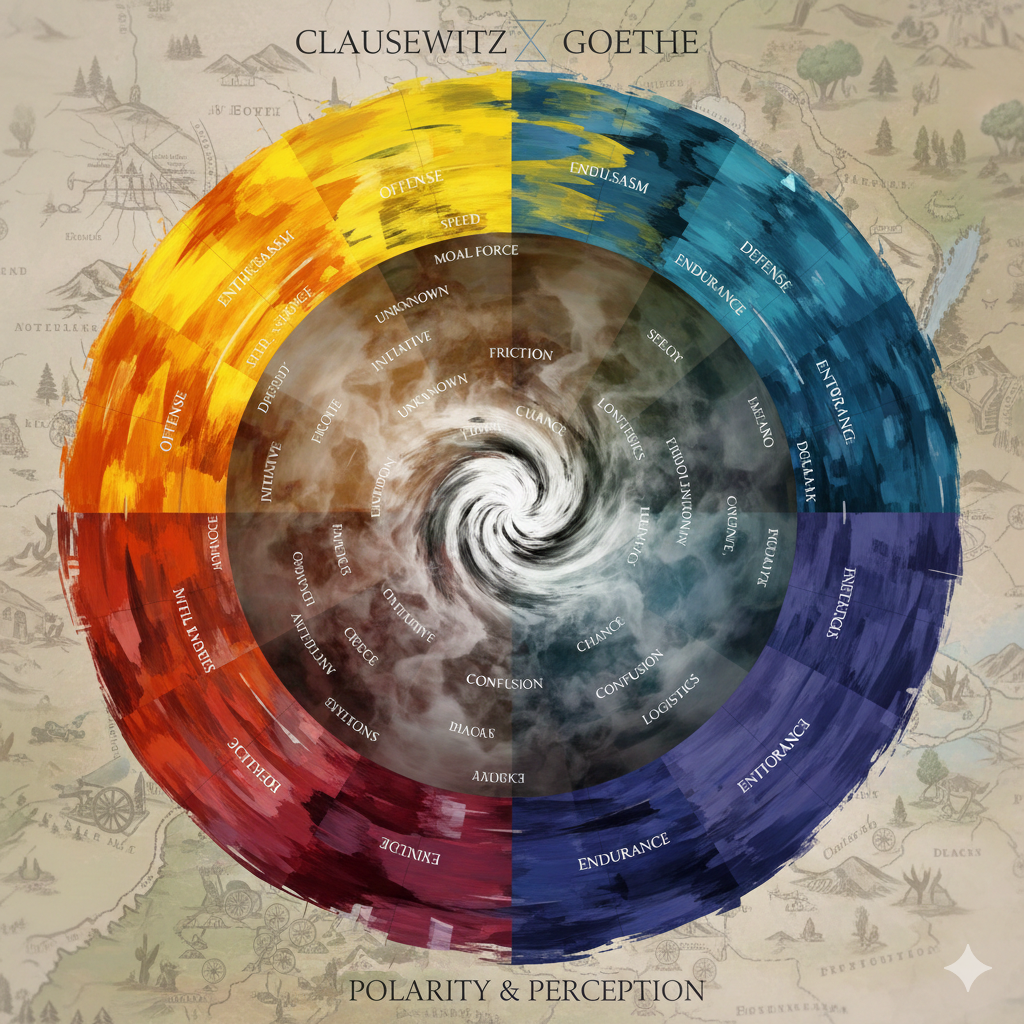
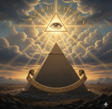
Image generated by AI ( Gemini)
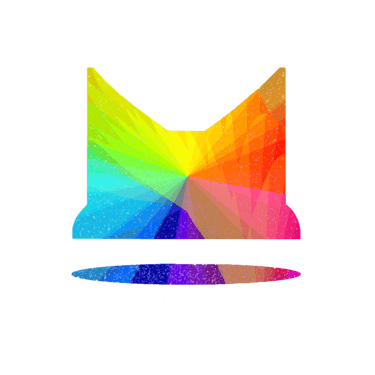
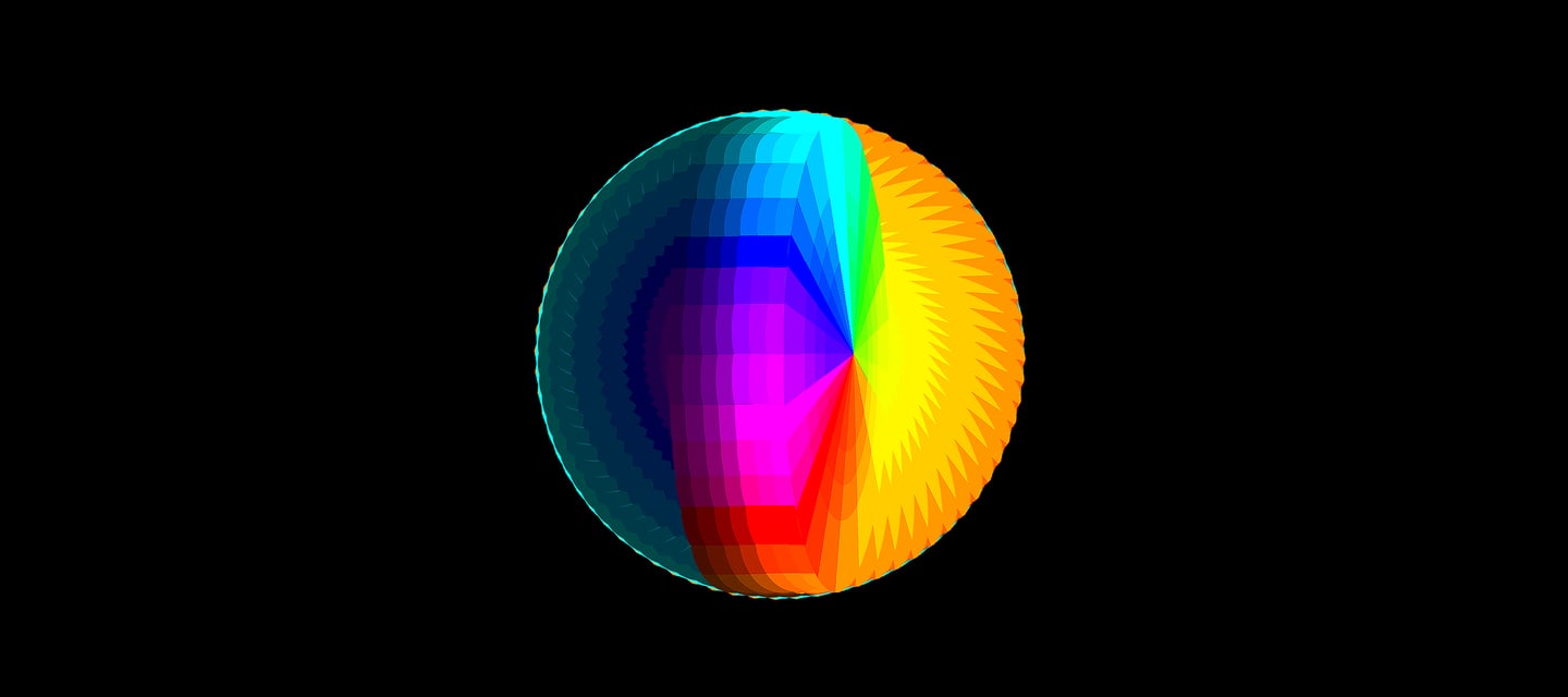
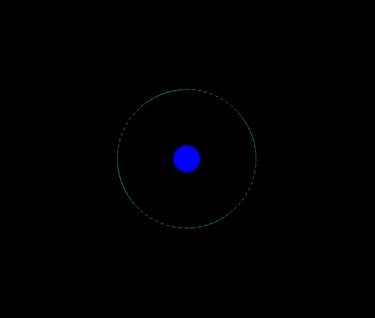
POLARITY & PERCEPTION • This is what a "Clausewitzian" color wheel might look like, blending military strategy with Goethe’s theory.
If you love colors, you know Goethe hated Newton’s idea that color was just a mathematical function of light. Goethe believed color was an active struggle between light and darkness.
THE POWER OF POLARITY
GOETHE'S VIEW • Color happens at the edge where light meets shadow. He called this "Polarity."
CLAUSEWITZ'S CONNECTION • Clausewitz used this exact same concept of "Polarity" to describe war. He didn't see war as a math equation; he saw it as a "fascinating trinity" of opposing forces (Logic vs. Emotion vs. Chance). Just as Goethe saw Yellow as the first step toward light and Blue as the first step toward dark, Clausewitz saw Attack and Defense as two poles of the same energy.
OBSERVATION OVER CALCULATION
Goethe and Clausewitz were both obsessed with the "Human Element."
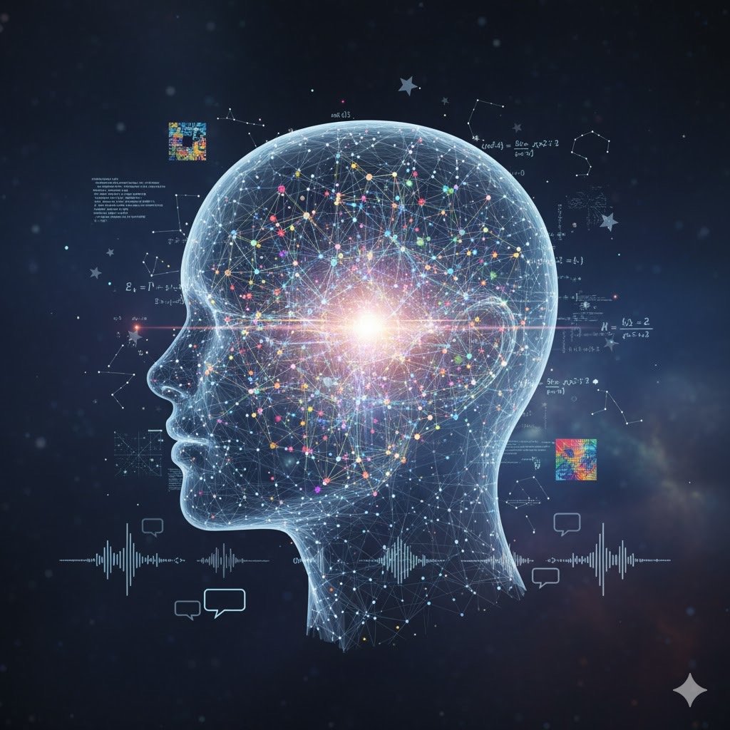
GOETHE • He argued that you can't understand a color just by measuring a wavelength; you have to understand how the human eye perceives it (subjectivity).
CLAUSEWITZ • He argued that you can't understand a battle just by counting soldiers; you have to understand the "Fog of War"—how the human mind perceives danger and uncertainty.
Image generated by AI ( Gemini)
This is where it gets personal. Clausewitz’s wife, Marie von Brühl, was deeply embedded in the same circles as Goethe: The intersection of art and strategy, or how subjectivity (Goethe's "eye of the beholder") meets reality (Clausewitz's "friction").
THE LITERAL CONNECTION
CLAUSEWITZ • He actually spent weeks reading the Goethe-Schiller correspondence while he was developing his theories. He wasn't just reading military manuals; he was reading the greatest poets and color theorists of his time to understand the "shades" of human behavior.
Image generated by AI ( Gemini)
THE RESULT • Color (The visible spectrum)
THE "FOG" • Turbid mediums (smoke/mist) that change how we see color
GOETHE'S COLOR WORLD
THE CORE • The struggle of Light vs. Dark
THE RESULT • Strategy (The visible action)
THE "FOG" • Friction (chaos/fear) that changes how we see the battlefield
CLAUSEWITZ'S WAR WORLD
THE CORE • The struggle of Will vs. Will
"Color is the child of Light and Shadow."
J.W. VON GOETHE
Organized into the "Plus" and "Minus" sides, just as Goethe intended, along with hex codes that match. The "Plus" side colors arise when light is slightly dampened by darkness. The "Minus" side colors arise when darkness is slightly weakened by light. The "Neutral" Point is the balance.
THE GOETHEAN COLOR COMPASS
Color
Hex Code
Goethe’s Emotional Meaning
Psychological Vibe
Yellow#FDE047The closest color to pure light.Serenity, gaiety, and soft excitement.
Red-Yellow#F59E0BThe peak of active energy.Warmth, gladness, and "increase."
Red#B91C1CThe climax where Plus and Minus meet.Gravity, dignity, and ideal beauty.
The "Plus" Side (Warmth & Action)
These colors arise when light is slightly dampened by darkness. They are exciting, active, and "giving."
The "Minus" Side (Depths & Yearning)
These colors arise when darkness is slightly weakened by light. They are cold, passive, and "taking."
Color
Hex Code
Goethe’s Emotional Meaning
Psychological Vibe
Blue#1E40AFThe color of darkness made visible.A sense of distance, coldness, and melancholy.
Blue-Red#7C3AEDA restless, anxious version of blue.Mystery and a yearning for the unknown.
Violet#581C87The deepest shadow before black.The sensation of a world ending or beginning.
The "Neutral" Point (Harmony)
Green (#064E3B): This is your Spruce Color. To Goethe, Green is the "Balanced" point where the Eye and Soul find rest. It is the perfect marriage of Yellow (Light) and Blue (Shadow).
Direction
What you see
The Result
Nature's Example
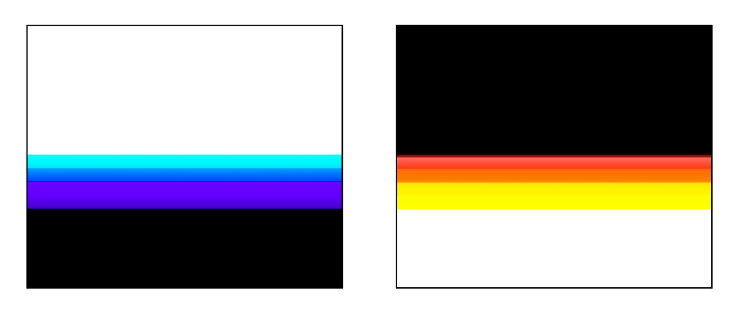
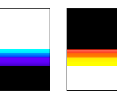
Light → Milky → YOUSeeing light through the haze.Yellow / RedLooking at the Sun (it turns yellow/red at sunset as the "haze" gets thicker).
Dark → Milky → YOUSeeing dark throughilluminated haze.Blue / VioletLooking at Space (the black void of space seen through our sunlit atmosphere looks Blue).
The "Orientation" Rule (The Two Directions)
Goethe's biggest breakthrough was realizing that color depends entirely on which way you are looking through the "milky" scatter. The "orientation" of light and dark through that "milky" medium (the Turbid Medium or Trübe) is what actually births the colors.
The Metal: Is it gold or silver?
Gold is Goethe’s "Plus" side (the Yellow light).
Silver is the "Minus" side (the Blue/Moonlight shadow).
The Prism vs. The Pure Light
Goethe’s whole argument against Newton was that Newton thought the colors were inside the light (like pieces of a puzzle). Goethe said, "No, the Light is one thing. It is pure, simple, and indivisible."
The Light: This is the Truth. It is clear. It is 100%.
The "Milky" Haze: This is the world. It’s the atmosphere, the glass of a prism It’s the interference.
The Color: This is what happens when the Truth (Light) gets "interrupted" by the world.
The "Astronaut" Perspective on Color
Since we were talking about Goethe's color cubes and scattering, this is a perfect moment to bridge that "astronomy" thought back to color. When astronauts like Michael Collins looked back at Earth from the darkness of space, they saw exactly what you were asking about—The Scattering Cube. The reason the Earth looks like a glowing blue marble against the pitch-black sky is exactly Goethe’s "Darkness through a Milky Medium" rule. The atmosphere is the "milky/translucent" layer. When the sun (Light) hits that layer, but you are looking past it into the blackness of the universe (Dark), the scatter turns Blue. According to Goethe, that’s exactly how you create Brilliance: by placing a point of high light against a deep, balanced shadow.
Michael Collins • was one of the three astronauts on the famous Apollo 11 mission to the moon (he was the one who stayed in the command module while Neil Armstrong and Buzz Aldrin walked on the surface) and his wife Eileen Collins was the first female Space Shuttle commander.
The "Cube" and Transparency
In design, Transparency is "The "Flat " Effect (where things just get fainter) and Translucency is The "Milky" Effect. Scattering (The "Milky" part): Imagine a cube filled with slightly soapy water or mist. If you put a light behindit, the cube glows Yellow. If you put the light beside it and look at a black background, the cube glows Blue. A Dark Background should have a slight Blue/Cyan glow around the edges and If you have a Light Background should have a Yellow/Red "halo."
Weaving the "Invisible" Scatter
In physics (and Goethe's eyes), this is called Rayleigh Scattering (not totally transparent just translucent). Small Particles use tiny, fine textures (like magical spider weaving web of photons ). When you overlap these layers of translucent fine textures. the color should intensify. Goethe called this Steigerung (Intensification).
Yellow → Orange → Red: As you add more layers in front of the light.
Blue → Indigo → Violet: As you make the "milky" layer thinner in front of the darkness.